Fried Frank
PROJECT
Corporate Logo, Identity Standards and Marketing Materials
CHALLENGE(S)
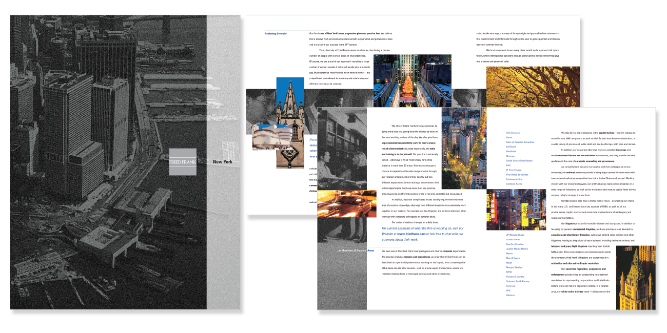
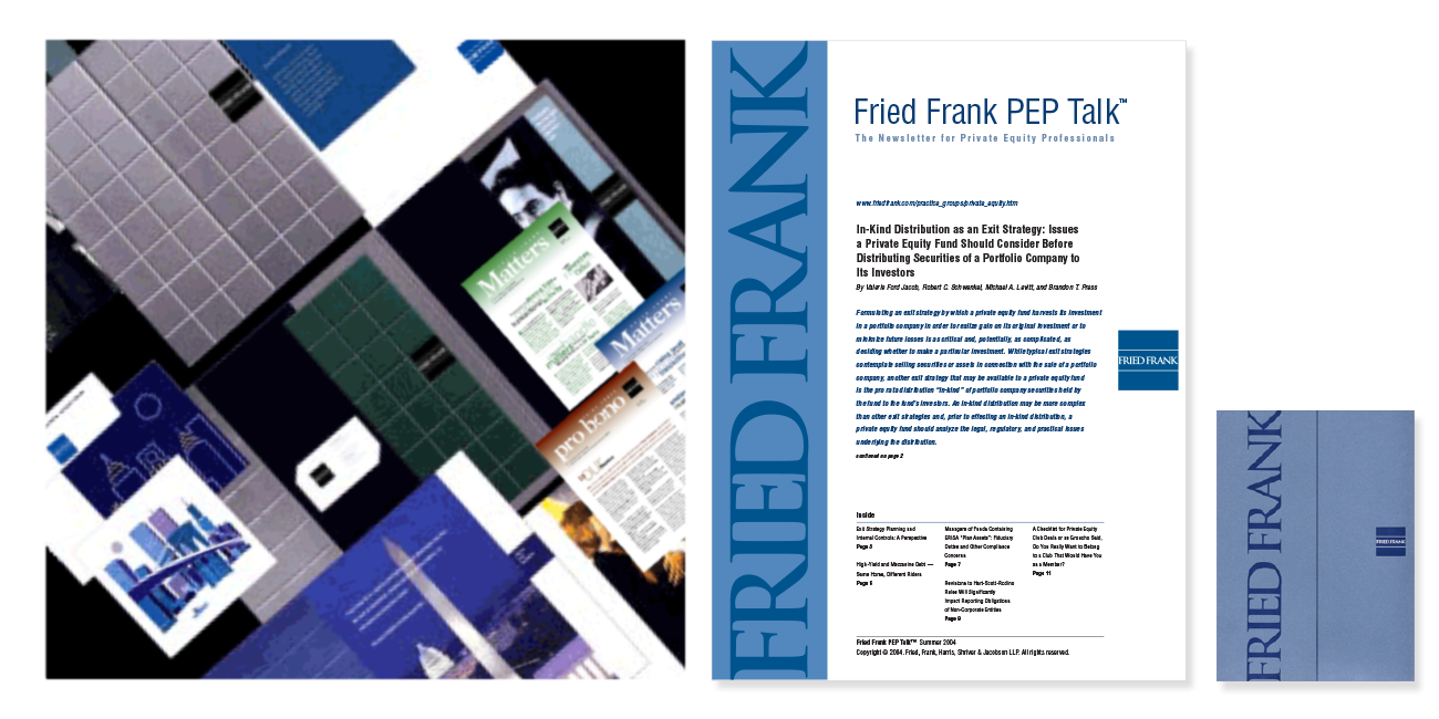
Create a logo for this international law firm and incorporate it into a complete marketing system.
![]()
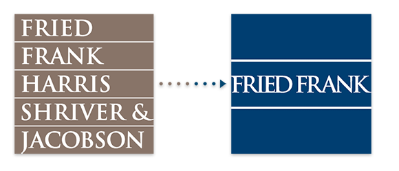
Symmetrical, custom typography, balance and equality, foundation. In dropping the names Harris, Shriver & Jacobson from the logo, we focused the new logo on expressing the stability of the firm. We strengthened this concept maintaining parallel rules above and below the name to emphasize balance. Identity standards and templates were developed for all communications materials – from stationery and recruiting items to pro bono announcements, publications, events and more.
Logo History – We designed the firm’s initial logo to include all 5 names of the founding partners. A few years later we redesigned the logo to its shortened Fried Frank name.