
Design thrives in context—exploring its role in both professional and personal worlds.
Design thrives in context—exploring its role in both professional and personal worlds.

In 1977, New York City was in crisis — crime was rampant, the economy was faltering, and morale was low. Amid this turmoil, Milton Glaser created the iconic “I Love NY” logo, a simple yet powerful design that became a symbol of hope and pride. Little did he know, it would become one of the most enduring symbols of urban identity in the world.
At its core, this philosophy is about transformation. It’s not just about creating something visually appealing; it’s about solving problems, addressing needs, and making things better. Every project begins with a question: What isn’t working, and how can design make it better?

Originally part of a campaign to revive tourism, the logo’s emotional resonance transformed it into a cultural icon. Fast forward to today, as New York faces modern challenges like rising crime and economic uncertainty, Glaser’s design remains a beacon of unity. It reminds us that New York isn’t just a place—it’s an idea, a feeling, and a community that people from all walks of life can love and contribute to.
Milton Glaser once said, “Good design is good citizenship.” This certainly still rings true! His “I Love NY” logo exemplifies this ethos, transcending graphic design to become a symbol of hope, pride, and possibility. As New York continues to shape its future, Glaser’s work reminds us of the city’s enduring capacity to inspire and connect.

The refinement of this iconic logo, which has represented the Modern Art Foundry for over 90 years, was undertaken with the goal of preserving its legacy while enhancing its versatility in digital and print mediums. The intricate, illustrative figure—a symbol of craftsmanship—was streamlined to maintain its detail while improving clarity across various scales and platforms.
To complement the refined illustration, we introduced a modern sans-serif typeface for “Modern Art Foundry,” utilizing a combination of thin and bold weights. This contrast provides a contemporary touch, enhancing legibility and creating a visual balance between the classic illustration and the updated text. The new typography maintains the brand’s legacy while aligning it with current design standards.
![]()
Additionally, a gold gradient was incorporated into the logo, symbolizing the molten metal central to the sculpture casting process. This gradient not only evokes the warmth and fluidity of casting but also adds depth and dimension. The golden tones further emphasize the artisanal craftsmanship of the Modern Art Foundry, forging a strong connection between the logo and its heritage. Together, the updated typography and color palette create a harmonious blend of tradition and modernity, reinforcing the brand’s legacy and its relevance in contemporary design.
Please visit my very talented friend Jeffrey Spring’s Foundry at: www.modernartfoundry.com.

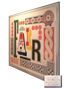 Bob Paganucci’s big break was when he landed a job with his future mentor – Mr. Rand at IBM – heading up their design center, back in the 1960’s. My mentor’s mentor was an idealist and a realist, a visual composer. “Don’t try to be original. Try to be good.” I was fortunate to grow up with many of his works in our home. In fact, several still hang on our walls. This print shown below has always been one of my favorites.
“Design is the method of putting form and content together. Design, just as art, has multiple definitions; there is no single definition. Design can be art. Design can be aesthetics. Design is so simple, that’s why it is so complicated.”

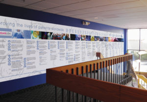 To highlight Celgene’s major accomplishments, milestones and patents, we designed and developed a 32’ x 5’ visual timeline wall mural. The timeline highlights achievements for a 16-year period and is produced on an adhesive vinyl. This was designed in a modular fashion to accommodate add-ons as future accomplishments and goals are developed. The background of the mural displays an illustrative treatment of actual Celgene research cells. The mural is displayed in several office locations.

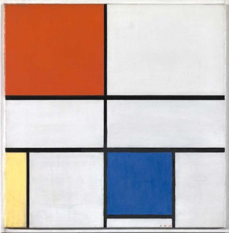 Piet Mondrian is a Dutch artist best known for his abstract paintings. He became an important artist whose ideas and work influenced lots of later artists. Mondrian did not use a ruler to measure out his lines! He thought carefully about where to place the lines, like those that you see in this painting. The red, yellow and blue are placed to the side and the centre of painting doesn’t have any color. I have certainly used his primary color, composition and grid-type techniques in many ways. ↑ go to top

We were tasked with creating a logo that captures the essence of Southern Rhode Island Volunteers (SRIV), focusing on the core values of warmth, care, and devotion. The design centers around a unique “V” formed by a series of hearts, symbolizing the deep compassion and commitment of SRIV’s volunteers. The hearts represent the very essence of SRIV’s mission: volunteers giving with heart and serving with dedication. The design also embodies SRIV’s promise to be an active part of the solution to the needs of Southern Rhode Island residents.
The color palette was carefully selected to reflect the vibrancy and energy of the communities SRIV serves. The blue evokes a sense of calm and is widely associated with benefits to the mind and body, reinforcing SRIV’s steady and reliable support. The red brings a dynamic contrast, symbolizing joy, vitality, and the passion volunteers bring to their service.
Together, the elements of this logo visually convey SRIV’s ongoing commitment to enriching lives through heartfelt volunteerism.
![]()
The logo has been recognized for excellence in design, winning the “Identity, Not-for-Profit” award by the NJ Ad Club and receiving accolades from several other organizations.
I stumbled upon this recently in one of my art director books and recalled the fun, challenges in creating this literature and brand ID system for J.H. Cohn.
To reflect J.H. Cohn’s mission of guiding clients through the complexities of their business life cycle, we developed a cohesive brand identity system centered around a path motif. This visual element symbolizes the organization’s commitment to leading clients through challenges with clarity and purpose.
The corporate brochure and modular practice brochures shown here embody this concept, blending continuity and adaptability to address diverse audiences. Each piece aligns with the overarching brand while allowing for unique expressions of expertise
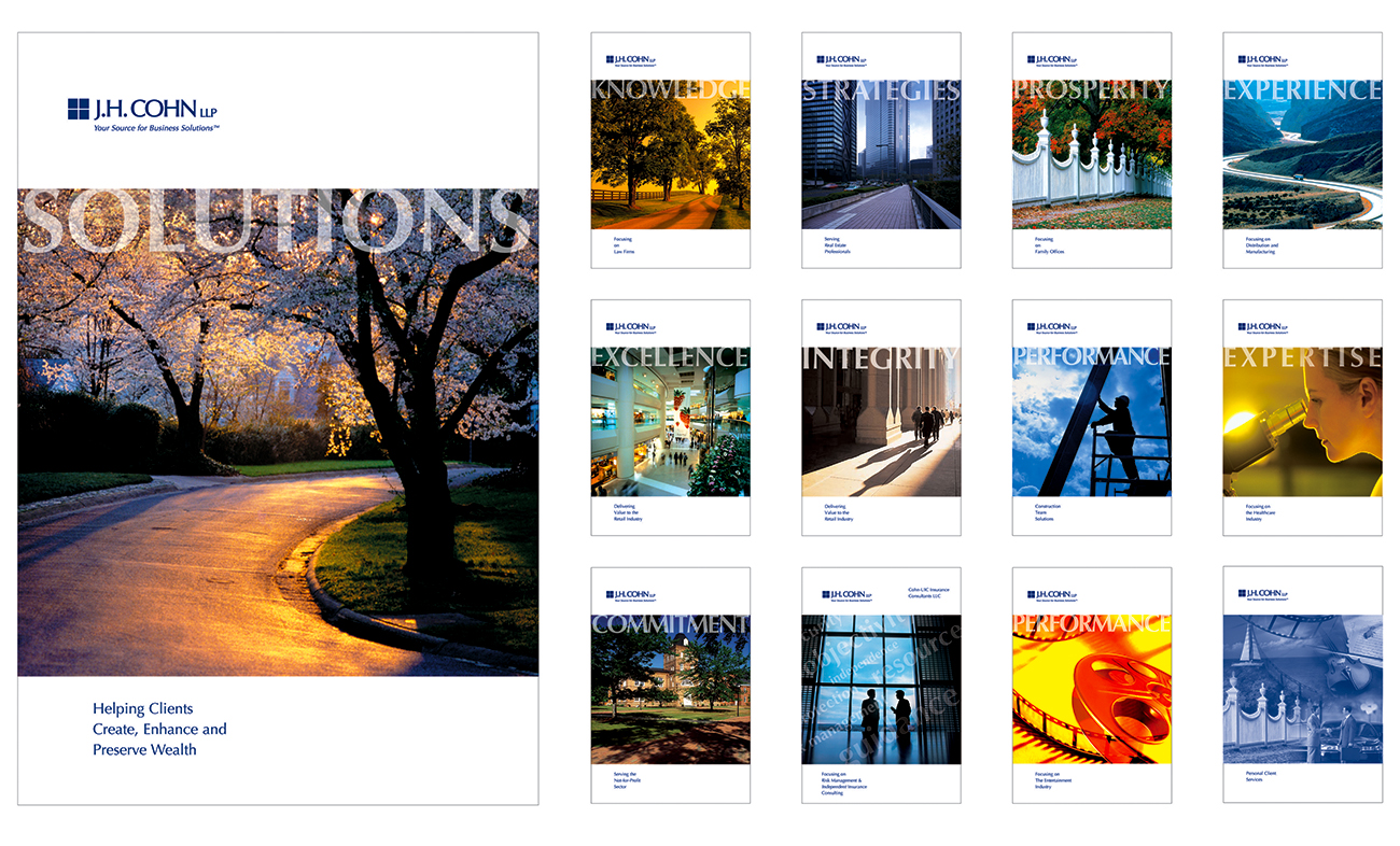
Additionally, we designed the firm’s logo to reinforce this identity, creating a unified and timeless visual foundation for the brand. Revisiting this work reminds me of the creative challenges and satisfaction of developing a system that is both strategic and visually compelling.