Remco
PROJECT
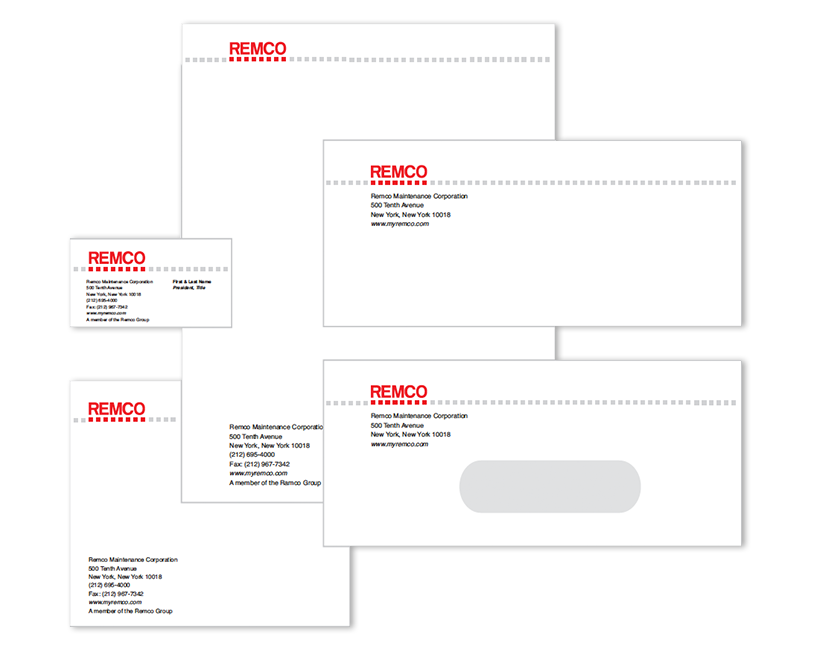
Brand and Corporate Identity
CHALLENGE(S)
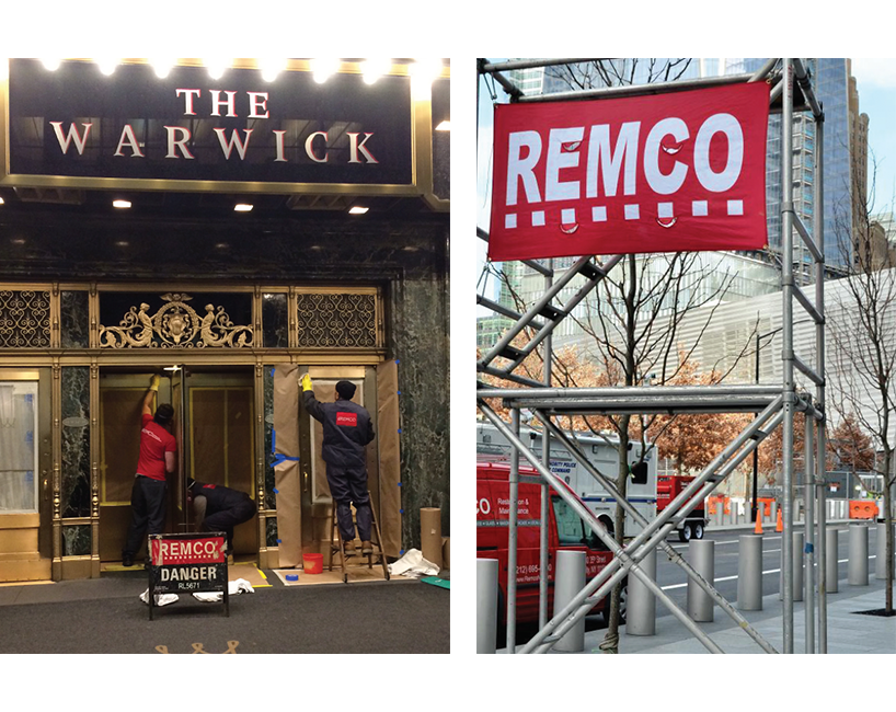
To create a highly visible, memorable logo that would be suitable for application to a complete continuity program for a large provider of metal, marble and masonry services in New York City.
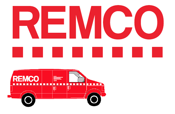
As Remco is a building maintenance company specializing in marble enhancement, we used a clean, sturdy typeface, floating above eight foundational squares to serve a dual purpose: 1. to be incorporated into the logo as an identifier and 2. to function as highly visible warning on caution/danger signs outside buildings undergoing restoration. The attractive red color allows the logo to stand out. The solution resulted in a cohesive program that united all visible representations of the company under a single banner.